
A few years ago, before the explosion of the Web into popular culture, and especially before Facebook and social networking brought the concept to surface in a directly personal concept, few outside mathematics were interested in graphs. Today, however, they have become extremely popular for intuiting the vast weave of interconnected, but irregular or incomplete, data that's become so prevalent. Graph databases such as Neo4j have risen in the space known as NoSQL to replace traditional relational databases for solving certain types of problems with incredible speedups. However, tools like this require a certain level of technical arcana that make them inaccessible or uninteresting to many. A higher level tool, and the subject of this post, are the graph visualizers.
The trailblazer in this area, still with a somewhat steep learning curve for those not comfortable with text-based work, is the venerable GraphViz. GraphViz consumes a text file, specifying nodes and their contents, and outputs a beautiful (sometimes) graphic. It can even do things like render to SVG or image maps, which seems rather quaint at this point. Still, the most interesting and useful component of GraphViz is its library of layout heuristics, which vary from using edge-weights as spring forces in a simple simulation using Hooke's law to any variety of assorted other techniques which have demonstrated utility. These live on in newer tools, thanks to GraphViz's open source licensing.
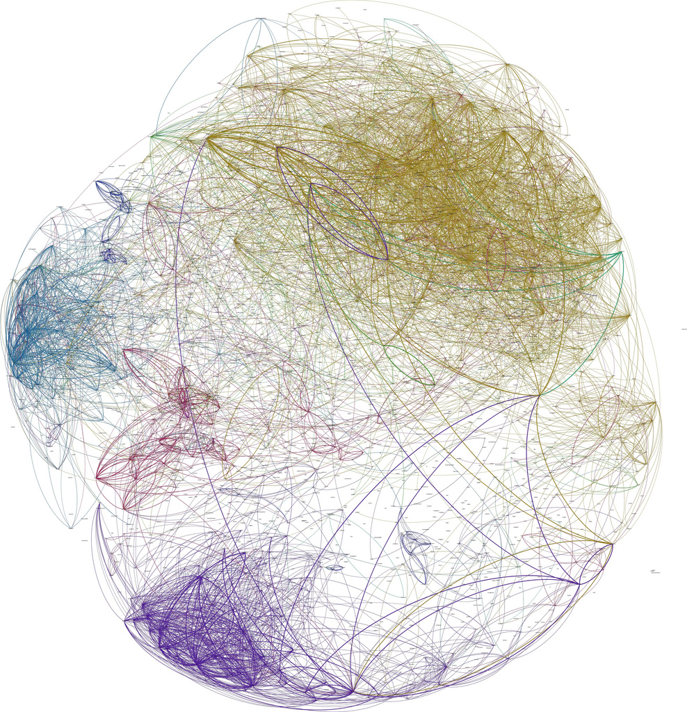 One of these newer tools, and the one I'm most excited about currently, is Gephi, which aims to be "like Photoshop™ for graphs." This builds on GraphViz's functionality via a nice graphical interface, which allows for more interactive and real-time layout options. Graph coloring, layout, and even direct vertex and edge manipulation are possible in an exploratory editor, as well as a wide variety of analytical statistics. One of my favorite example graphs is the one pictured here, by Franck Cuny, of the connections between open-source software projects on Github. He's made views showing the connections within specific countries and programming languages, as well, which lend themselves more to seeing the true shape of the community. His blog post goes into greater detail and is well worth the read.
Of course, while Gephi may have depth, it still has a learning curve. Luckily, it has companions for broad accessible, in the form of Flash applets such as GexfExplorer, which can be directly embedded in a web page. This is certainly a more limited tool, but with some extra backend work by web developers, could be a great boon to navigation of complex subjects. There are also some very interesting commercial offerings, such as the Java applet from TouchGraph, which allows interactive traversal of datasets from companies such as Facebook and Amazon, and the amazing French company Linkfluence, certainly a leading consultant in this emerging field.
Here at Arts & Sciences, we could have potential uses for this too. For instance, setting up nodes to represent different course offerings, with edges weighted by students who took or did well in both courses, we could get a nice visualization of the interconnectedness of disciplines. For large datasets of natural language, we could use Levenshtein distance, or some variation, to find similar blocks of content in scholarly content, which could open new avenues of research. Hopefully we'll be able to explore this union of aesthetics and functionality more in the future. Personally, I think it's going to be a very interesting field.